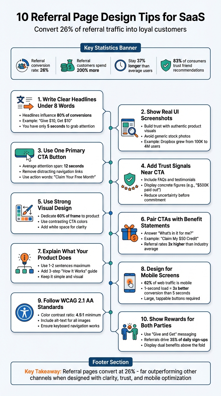
10 Referral Page Design Tips for SaaS
Clear, mobile-first referral page tips to boost SaaS sign-ups: short headlines, one CTA, real UI screenshots, trust signals, accessibility, and dual rewards.

Justin Britten
Your referral page is more than just a landing page - it’s where warm leads, already primed by a friend’s recommendation, decide to sign up. Referral pages convert at an average rate of 26%, far outperforming other channels. Here’s why they matter and how to make them effective:
- Referral customers spend 200% more and stick around 37% longer than average users.
- Generic homepages create confusion, while referral pages focus on one goal: sign-ups.
- The secret? A clear design, trust-building elements, and mobile optimization.
Key Takeaways:
- Keep headlines short (under 8 words) and focused on benefits: “Give $10, Get $10.”
- Use real UI screenshots to build trust and show your product in action. Looking at SaaS referral program examples can provide inspiration for your own layout.
- Stick to one primary call-to-action (CTA) to reduce decision fatigue.
- Add trust signals (FAQs, testimonials) near your CTA to reassure users.
- Mobile-first design is critical - 62% of web traffic is mobile.
- Follow WCAG 2.1 accessibility standards for inclusivity.
- Clearly explain what your product does in simple terms.
- Highlight dual rewards for referrers and friends to encourage action.
By focusing on clarity, trust, and usability, you can turn more referrals into loyal customers.
10 Essential Referral Page Design Tips for SaaS Companies
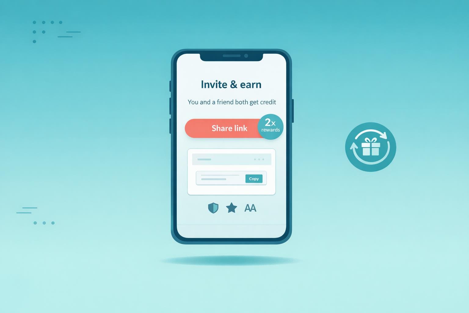
1. Write a Clear Headline Under 8 Words
Clarity in Messaging
Your headline has just five seconds to grab attention and convince visitors to stay on your referral page. Experts estimate that the headline alone influences 80% of visitor conversions. When someone clicks a referral link from a friend, they already have some trust in your brand - but they still need instant confirmation they’re in the right place.
The most effective referral headlines follow the "Give/Get" formula, answering the all-important question: "What's in it for me?" For example, Soko Glam uses "Give $10, Get $10", Viral Loops opts for "Give 20%, Get $20", and Benefit Cosmetics keeps it simple with "Give your besties 10% off". These headlines are all under five words, delivering crystal-clear benefits with no room for doubt. Considering that 83% of consumers trust recommendations from friends and family over ads, your headline must immediately reinforce that trust.
Stick to plain, direct language that spells out the benefit. For instance, a vague headline like "Unlock Amazing Opportunities" might sound enticing but doesn’t communicate a tangible reward. Compare that to options like "Get free socks!" (3 words) or "Invite Friends, Earn Rewards!" (4 words). These examples are concise, clear, and action-oriented.
Short, clear headlines don’t just improve comprehension - they also make your page more user-friendly, especially on mobile.
User Experience (UX) Optimization
On mobile devices, addressing the "What's in it for me?" question becomes even more critical. Short headlines are not only easier to read but also naturally mobile-friendly. Lengthy headlines exceeding eight words can wrap awkwardly on smaller screens, potentially pushing your call-to-action (CTA) out of sight. This creates unnecessary friction, which is costly when the average attention span is just 12 seconds. A concise headline ensures visitors quickly understand the offer and act without scrolling.
Adding personalization takes this a step further. If your referral system can dynamically include the referrer’s name - like "Sarah sent you a free month" - you validate the recommendation while acknowledging an existing relationship. This approach reduces friction and strengthens trust. Tools like Prefinery make it easy to implement dynamic personalization without requiring advanced coding, ensuring every visitor feels a personal connection to the offer.
2. Show Your Product with Real UI Screenshots
Pair your straightforward headlines with visuals that back up your claims right away.
Visual Impact and Design
Using real UI screenshots shows that your product is genuine and functional. High-quality images of your software help build trust and make your offering feel credible, while generic stock photos can have the opposite effect, undermining confidence in your brand. Visual design plays a key role in shaping how people perceive your product. When someone clicks on a referral link from a friend, seeing the actual interface reassures them that they’re in the right place and validates the recommendation.
Showcasing "hero-shots" of your software’s standout features can help potential referrers picture the rewards they’ll gain. Instead of relying on lengthy descriptions, let visuals do the talking. For instance, screenshots of a premium dashboard, advanced analytics, or exclusive tools make the benefits feel real and enticing. A great example is Dropbox, which skyrocketed from 100,000 to 4,000,000 users by integrating in-product visuals and clear UI to highlight referral rewards.
User Experience (UX) Optimization
Screenshots simplify complex ideas by replacing heavy text with clear visuals. For example, showing a referral dashboard where users can track their progress adds transparency. A simple 1-2-3 screenshot guide can make it easy for users to understand how to generate and share referral links.
Ensure your screenshots are designed for both desktop and mobile screens to maintain readability. Mobile visuals should emphasize the app’s interface, while desktop screenshots should reflect the web experience. Stick to your brand’s colors and typography to strengthen brand recognition. This approach works best with a clean, single-focused referral page layout.
Accessibility Compliance
To make your visuals accessible, use high-contrast screenshots that are easy to read. Additionally, include text alternatives for all images so visitors using screen readers can still understand the content. These steps not only support users with disabilities but also improve overall clarity and usability across your page.
3. Use One Primary Call-to-Action Button
Clarity in Messaging
Stick to one clear, dominant call-to-action (CTA) to guide visitors. With an average attention span of just 12 seconds, you need to make your ask crystal clear. Bombarding users with multiple buttons can lead to confusion or hesitation. A single, focused CTA keeps them on track and increases the likelihood they'll take action.
Make your CTA verb-focused and benefit-driven. For example, instead of generic phrases like "Submit" or "Click Here", try something like "Claim Your Free Month" or "Get My 20% Off." Using first-person language, such as "Get My Discount," also feels more personal and engaging. This kind of direct, action-oriented phrasing grabs attention and encourages clicks.
Visual Impact and Design
Your CTA button should visually dominate the page. To achieve this, design it with high-contrast colors, plenty of white space, and smart positioning. If your page has a busy background, frame the button to make it pop even more.
"A successful landing page is a dead end, in a good way. There are no links to your 'About Us' page or company blog... There is only one path forward: the call-to-action button." – Viral Loops
User Experience (UX) Optimization
Place your CTA above the fold so users see it immediately without scrolling. If your page is longer, repeat the same CTA further down, ensuring users can act wherever they are on the page. Remove any extra navigation links that might distract from your main goal. This streamlined approach is critical, especially when referral conversion rates are already three times higher than the industry average of 3.64%.
For SaaS startups, platforms like Prefinery make it easy to implement referral program best practices with customizable, no-code referral pages. Unlike generic templates that often include unnecessary elements, Prefinery keeps the focus on your single, standout CTA.
Accessibility Compliance
Don’t overlook accessibility when designing your CTA button. Use high color contrast to accommodate users with color vision deficiencies. Make the button large enough for easy tapping on mobile devices, and include text alternatives for screen readers. These small adjustments not only make your page more inclusive but also improve usability for everyone.
4. Add Trust Signals Next to Your CTA
Clarity in Messaging
Trust signals should be straightforward and easy to spot. Instead of overwhelming users with dense legal jargon, opt for a simple FAQ or a direct link near your CTA. This approach clears up any confusion about things like reward eligibility, payout timelines, or program rules - before users make a commitment.
"Replace dense, legal-sounding terms and conditions with a user-friendly FAQ addressing questions like: 'When will I receive my reward?'... This makes the information clear, accessible, and less intimidating." – Waseem Bashir, CEO at Apexure
If your program allows unlimited rewards, make it obvious with statements like "Earn Unlimited $50 Credits". Pair this with a simple three-step "How It Works" diagram to show users exactly what to expect. These clear trust signals naturally guide users toward your CTA by reducing uncertainty and hesitation.
Visual Impact and Design
The placement of trust signals near your CTA can seamlessly combine clarity and credibility. Add elements like security badges, "As Seen On" logos, or concise testimonials right next to your CTA button to validate the user's decision at the critical moment. To maintain focus, keep these elements subtle - smaller and less colorful than the button itself - so they support rather than overshadow your CTA.
White space plays a key role here. Surrounding your CTA and trust signals with ample space keeps the design clean and ensures users focus on what matters most. This approach is especially effective on mobile devices, where screen real estate is limited.
User Experience (UX) Optimization
Reinforce trust by displaying concrete figures, such as "$500,000 in referral commissions paid out", near your CTA. Highlight details like automated payout systems or integrations with trusted payment processors like Stripe. These additions reassure users that payouts will be accurate and reliable, boosting confidence at the moment of decision.
5. Use Strong Visual Design Elements
Visual Impact and Design
Your referral page has just 12 seconds to grab attention and communicate its value. Start strong with a high-quality hero image or video that dedicates at least 60% of the frame to showcasing your product. Ditch generic stock photos - real product images are far more effective at building trust.
Colors play a huge role in guiding behavior. Use a contrasting color for your call-to-action (CTA) button, like bright orange or red against a neutral backdrop. Here’s a quick test: squint at your page. If your CTA doesn’t stand out as the most visible element, it’s time to rethink your design. Keep things clean by adding white space around your headline and CTA. This reduces clutter and makes the page easier to navigate.
When these visual elements are in place, your messaging will naturally take center stage.
Clarity in Messaging
A clear visual hierarchy ensures users focus on what matters most. Your value proposition - think something like high-converting referral incentives such as "Refer Friends, Earn $50" - should be the largest text on the page and positioned above the fold, so visitors see it immediately without scrolling. Break up text with bullet points or short paragraphs to avoid overwhelming users with a wall of information. Adding icons or simple infographics to explain your "How It Works" process can make your content more digestible and engaging.
When visuals and messaging work together, users can navigate your page effortlessly.
User Experience (UX) Optimization
Consistency across your brand builds trust instantly. Your referral page should match your main site’s color palette, typography, and logos, creating a seamless experience. Since most social sharing happens on mobile devices, make sure your design is mobile-friendly. Buttons should be large enough to tap easily, and text should remain readable without the need to zoom in. Keep forms simple - ask only for essentials like name and email to reduce friction.
Platforms like Prefinery can help streamline this process. By using tools to automate referral marketing, you can focus on design while the system handles tracking and rewards. Their customizable templates ensure your referral page maintains a consistent design across devices, helping you engage users and boost conversions.
6. Pair CTAs with Benefit Statements
Clarity in Messaging
A strong call-to-action (CTA) is essential, but pairing it with a clear benefit statement takes it to the next level. Visitors want to know, "What's in it for me?" - and that's exactly what your benefit statement should answer. Instead of letting your CTA button stand alone, give it context with action-focused language that highlights the reward. For example, a phrase like "Claim My $50 Credit" makes the benefit immediately clear.
"The most critical element of a high-converting referral landing page is the value proposition - answering, 'What's in it for me?' Highlighting tangible benefits, like rewards or discounts, can greatly boost conversions."
― Waseem Bashir, Founder & CEO at Apexure
Keep your benefit statement short and sweet - just one or two sentences - and position it right above or below the CTA button. This way, users instantly understand the value you're offering. Pairing clear messaging with thoughtful design ensures the benefit is impossible to miss.
Visual Impact and Design
The placement of your benefit statement is just as important as the words themselves. Keeping it close to your CTA button - either directly above or below - creates a seamless connection between the action and the reward. To make the benefit stand out, use bold text or a contrasting color, but ensure it complements rather than distracts from the CTA button. Words like "free," "save," or "earn" can quickly communicate value and grab attention.
User Experience (UX) Optimization
When CTAs are paired with benefit statements, the value proposition becomes crystal clear, reducing any hesitation visitors might have. A personalized message, such as "Sarah sent you 20% off," adds a reassuring, human touch. This is especially effective, considering that 83% of people trust recommendations from friends and family more than traditional advertisements.
If your page is lengthy, repeat the CTA and benefit statement further down, after detailing your product or service. This ensures the offer stays top of mind as users scroll. With referral conversion rates reaching 3.64% - three times higher than the industry average - fine-tuning this pairing can have a huge impact on your results. By making the reward clear and accessible, you’ll reduce friction and encourage more conversions, a win-win for any SaaS referral strategy.
7. Explain What Your Product Does
Clarity in Messaging
Your referral page isn't just about promoting the incentive - it’s also your chance to explain what your product actually does. Visitors coming through referrals might not know much about your SaaS, so keep it simple. Use one or two sentences to clearly describe your product’s main purpose. A "How It Works" section with a 3-step visual guide can help users understand both your product and the referral process without feeling overwhelmed. Simple icons or a clean diagram can tie your product’s function to the referral program seamlessly.
"Replace dense, legal-sounding terms and conditions with a user-friendly FAQ... This makes the information clear, accessible, and less intimidating."
― Waseem Bashir, Founder & CEO at Apexure
Avoid long paragraphs filled with product details. Instead, let visuals like icons and diagrams do the heavy lifting. Your subheadline should quickly highlight the main benefit your product offers, ensuring visitors know what to expect right from the start. This kind of clear messaging not only informs but also reassures users, working hand-in-hand with the design elements mentioned earlier.
Visual Impact and Design
Don’t just describe your product - show it. Use real visuals to demonstrate how it works, which helps build trust. Authentic UI screenshots can give referred users a clear picture of what they’re signing up for, even before they click your call-to-action. Explainer videos are another great option, as they can highlight your product’s value faster and more effectively than plain text.
User Experience (UX) Optimization
Keep it simple. Visitors only spend about 12 seconds deciding whether to stay on a page, so make every word and image count. Replace heavy blocks of text with visuals that communicate your value instantly. This approach is especially important because referral conversion rates can hit 3.64% - three times the industry average. A streamlined explanation not only grabs attention but also reduces friction, making it easier for users to take action.
8. Design for Mobile Screens
User Experience (UX) Optimization
With over 62% of internet users browsing on mobile devices, having a referral page that works seamlessly on smartphones is no longer optional - it’s essential. Your design should prioritize small screens from the outset. Make sure buttons are easy to tap without frustration, and text stays readable without requiring users to pinch or zoom. These adjustments go hand-in-hand with the clean design and clear messaging mentioned earlier.
Speed is another critical factor. A page that loads in just 1 second converts three times better than one that takes 5 seconds. To hit that sweet spot of 0–2 seconds, compress images, use a CDN, and optimize your code for faster loading.
Visual Impact and Design
Fast-loading pages are just the start. Thoughtful use of white space and bold visuals can guide users to act quickly. Surround buttons and text with enough space to avoid accidental taps and reduce mental clutter. Place your primary CTA and key message above the fold so users see them immediately upon landing. For your CTA button, pick bold, high-contrast colors like bright reds or oranges to make it pop against the page background.
Keep forms short and sweet. Typing on mobile keyboards can be a hassle, so stick to the basics - usually just a name and email field. The fewer fields you include, the less likely users are to abandon the page. Also, make sharing easy by including buttons for mobile-friendly apps like WhatsApp, Facebook Messenger, and SMS. These quick-share options fit naturally with how people use their phones.
Accessibility Compliance
Designing large, easy-to-tap buttons isn’t just about convenience - it also meets accessibility standards, making your page easier to use for people with motor impairments. Always test your referral page on actual mobile devices, not just desktop emulators, to spot issues with button placement, form functionality, and visual hierarchy across different screen sizes. A mobile-friendly, accessible design ensures you’re set up to turn interested visitors into loyal users.
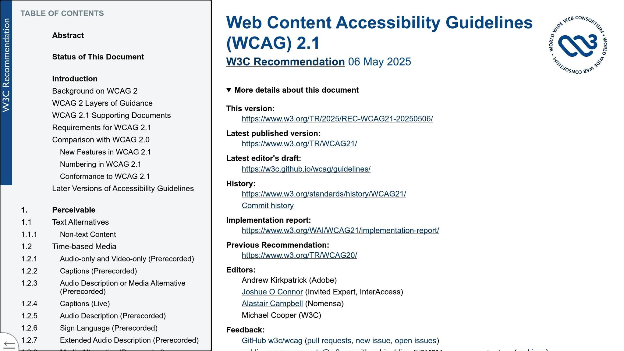
9. Follow WCAG 2.1 AA Accessibility Standards
Accessibility Compliance
Accessibility isn’t just a box to check - it’s about creating a referral page that everyone can use. Following WCAG 2.1 AA standards ensures your design is inclusive. For instance, maintain a minimum color contrast ratio of 4.5:1 for regular text (or 3:1 for larger text). If your primary call-to-action (CTA) button fades into the background at lower contrast settings, it’s a sign the contrast needs improvement.
Also, every image should come with descriptive alt-text, enabling screen readers to convey critical visual details. Avoid relying solely on color to communicate errors (like using only red text). Instead, provide clear, text-based instructions to help users resolve issues. These practices not only meet legal requirements but also make your page more user-friendly for everyone.
User Experience (UX) Optimization
Accessibility adjustments often lead to a smoother user experience. For example, keep form fields to the essentials - like just name and email - to make it easier for users with motor or cognitive challenges to complete forms. Providing instant validation feedback for errors ensures users can correct mistakes right away.
"Showcasing terms and conditions effectively rely on brevity and readability. Use layman's terms, break them down into bullets, and highlight the crucial points to ensure transparency."
– Rosario Maccarrone, Director at OPIT
Replace dense legal jargon with a simple, user-friendly FAQ addressing common concerns, such as, "When will I receive my reward?" Pair this with strategic white space to reduce cognitive load, helping users focus on what matters most. Finally, ensure interactive elements like buttons work seamlessly - this keeps users engaged and ensures they have a frustration-free experience.
10. Show Rewards for Both Referrer and Friend
Clarity in Messaging
Your referral page should immediately answer the question: "What's in it for both of us?" Using "Give and Get" messaging in your headline is a simple way to highlight mutual benefits. For example, a phrase like "Give $20, Get $20" instantly shows that both the referrer and their friend gain something. This approach lowers the hesitation some people feel about asking friends to join - they’re not just asking for a favor but sharing a benefit.
Be specific when explaining rewards. Use clear terms like "Referrer" and "Friend" to outline who gets what, and include the exact value of the reward, whether it’s a discount, credit, or free product. This clarity helps avoid confusion and builds trust, setting the stage for a design that visually underscores the benefits for both parties.
Visual Impact and Design
Visual elements can make your rewards more engaging and easier to understand. Use icons or images - like dollar signs, gift boxes, or product visuals - that convey the rewards at a glance. These help create an emotional connection and ensure the message is clear.
Place the dual reward offer prominently, ideally above the fold, so it’s visible right away. Highlight the rewards and calls-to-action (CTAs) with bright, contrasting colors to make them stand out. You could also add a progress bar or reward tracker to gamify the experience. Showing referrers how close they are to earning their next reward can keep them motivated.
User Experience (UX) Optimization
Two-sided rewards are more effective because they encourage action from both parties. When both the referrer and the friend benefit, the friend feels more motivated to complete the sign-up process. In fact, referral programs have been shown to drive 35% of daily sign-ups for some SaaS companies. Pairing these rewards with a single, clear CTA simplifies the decision-making process and makes it easier for users to act. The best time to highlight referral rewards is during key moments - like after a user achieves a milestone or completes an important action.
Since most referrals happen on mobile, ensure your referral page is fully optimized for small screens. Include one-tap sharing options for apps like WhatsApp and Messenger. Make sure your CTA buttons are easy to tap and meet accessibility standards, like high color contrast, to provide a seamless experience.
Tools like Prefinery make it easier to create referral pages that showcase dual-sided rewards effectively. Unlike basic templates, Prefinery offers customizable reward options, an intuitive tracker, and detailed analytics. These features can help SaaS startups encourage organic growth and keep users engaged. To wrap it up, designing a page where both the referrer and the friend clearly see their benefits is key to converting interest into action.
Conclusion
Creating high-performing referral pages hinges on clear design and user-centered elements. By reducing form fields, incorporating one-click sharing, and prioritizing mobile-friendly layouts, you can remove obstacles that hinder conversions. A headline that immediately answers "What's in it for me?" combined with visuals that direct users toward a single action can help turn interested leads into paying customers more efficiently.
The numbers back this up: 83% of people trust recommendations from friends, and referral conversion rates are three times higher than the industry average of 3.64%. However, that trust can quickly vanish if your referral page is cluttered, slow, or unclear. As Waseem Bashir, CEO of Apexure, explains:
"A well-designed referral landing page clearly and transparently explains the rewards, terms, and how the program works. It also allows users to easily generate referral links, reducing friction and encouraging participation".
Take a moment to review your current referral page. Try the squint test - when you squint at the screen, is your primary CTA button the most visible element? If not, it needs more emphasis. Make sure your value proposition and CTA are placed above the fold. Replace complicated legal language with clear, straightforward details addressing common questions about rewards, eligibility, and timing.
For startups looking for an easy way to implement these strategies, Prefinery offers customizable referral pages with built-in reward tracking and detailed analytics. Unlike generic templates, Prefinery gives you the flexibility and developer-friendly tools to create a seamless referral experience that encourages organic growth. Apply these design tips, test your page on mobile devices, and see your referral success take off.